


100+ job seekers save hours every week
Improving Job Tracking in Jobbox.cc
The complete inbox for your job search
Overview
What is Jobbox?
Role
UX Researcher UX Designer
Timeline
3 weeks
Team
Individual
Research
What People Are Saying
According to my research, 10/10 job seekers said they spend nearly 60% of their time just searching and tracking applications. To stay organized, they juggle Excel sheets, notes apps, and multiple platforms but still feel scattered. This leaves little time to focus on what really matters: preparing for interviews and actually landing the job.

Kathryn M
"I feel like I spend more time updating my Excel sheet than actually applying for jobs."

Savannah N
“My tracker is in Notes, my resume versions are in Google Drive, and my job links are in Chrome tabs… it’s all over the place.”

Marvin M
“Sometimes I forget to follow up because I can’t remember which stage I left things at.”

Diya R
“I literally have five different tools open just to track my applications, it’s exhausting.”

Richards R
“Job hunting feels like a second full-time job, and I’m not even getting paid for this one.”

Courtney H
“I know I missed an interview email once because I lost track in my messy system.”

Arlene M
“It would be so much easier if everything lived in one place instead of me patching it together.”

Devon Lane
“By the time I finish tracking applications, I barely have energy left to prep for interviews.”
Problem Statement
How might we empower job seekers to take control of their search by providing a simple, organized system for tracking applications?
Research Methods
I used a mix of user research and competitor analysis to get a complete picture of the problem and the market.
User Research
10
active job seekers interviewed
I held ten individual, one-on-one interviews to get deep, personal stories from users.
The interviews were semi-structured, allowing users to guide the conversation while still covering key topics.
A short online survey was used to confirm common problems and measure how often they happen.
Participants were chosen based on being actively in a job search for the last 6 months.
Questions centered on tracking applications, managing follow-ups, and the general stress of the search.
Competitor Research
5+
competitors analyzed
I analyzed five direct competitors, including Simplyfy, Teal, and Hunter, plus two others.
I used a simple chart to compare the core features and tools offered by each competitor.
Tested the user journey on each competitor's product (e.g., how easy it is to add a job)
Business Model Review: We noted how each company charges users (free, paid tiers, etc.)
Identified Key Strengths & Weaknesses: The analysis focused on what each competitor did well and where they were lacking.
Analysis
Key Insights
The research showed a few big things I needed to focus on to make JobBox truly helpful.
Job search is stressful
People feel overwhelmed by tracking many job applications at once.
Users want flexibility
Other tools usually only let you track jobs with fixed, basic statuses.
Hard to connect
It's often difficult to link these tools smoothly with job boards or email.
No clear overview
Users really want one place to see all their job application statuses easily.
Pay to play
Many useful features are locked behind a payment, which isn't great for job seekers.
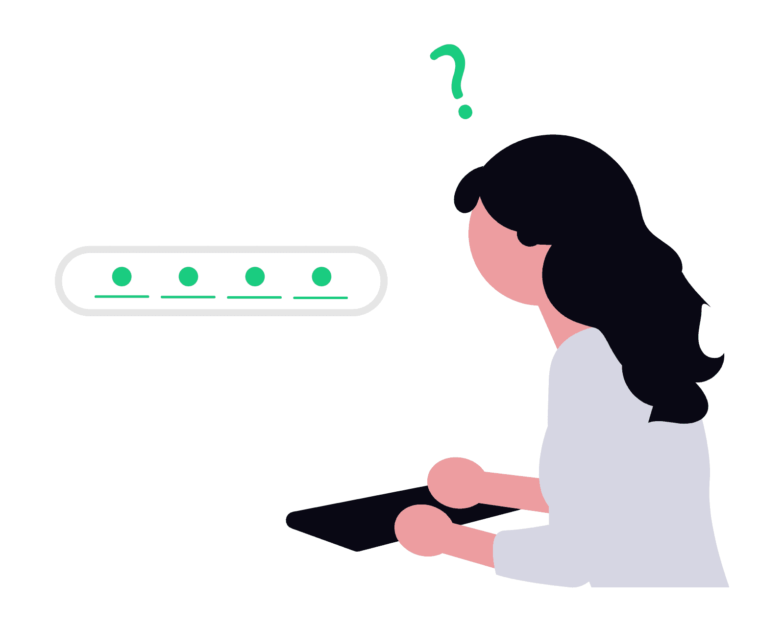
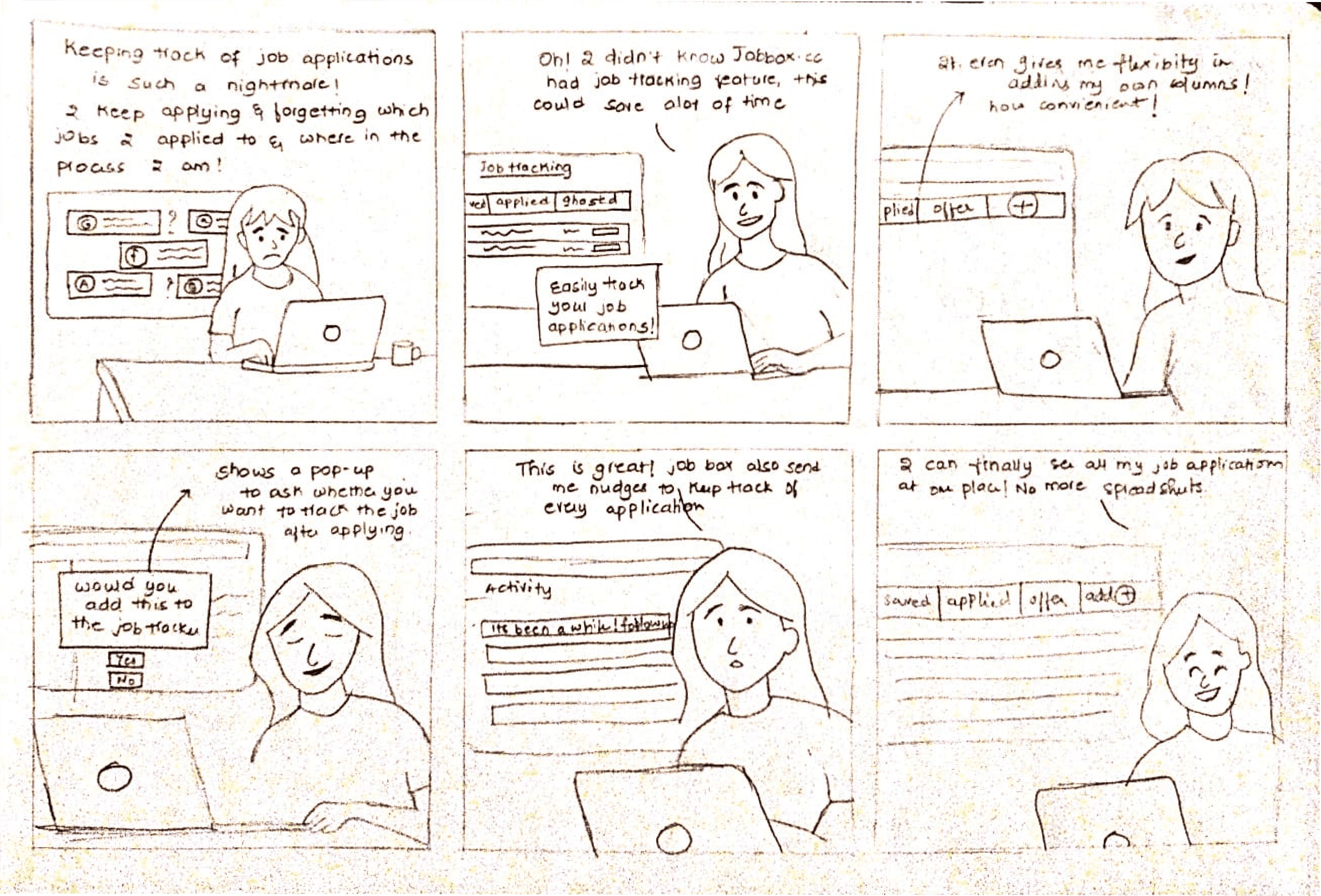
Storyboarding
Bringing Our User to Life:
The Sarah Persona
To build a product that truly helps, I first needed to understand who I was helping. Meet Sarah, a dedicated job seeker whose experiences and frustrations guided my design process. By stepping into her shoes, I aimed to design a solution tailored to real-life needs.
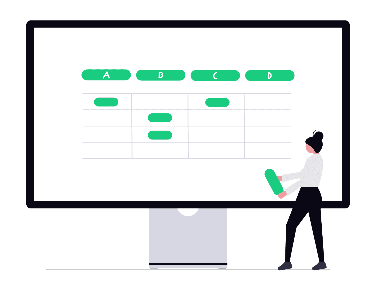
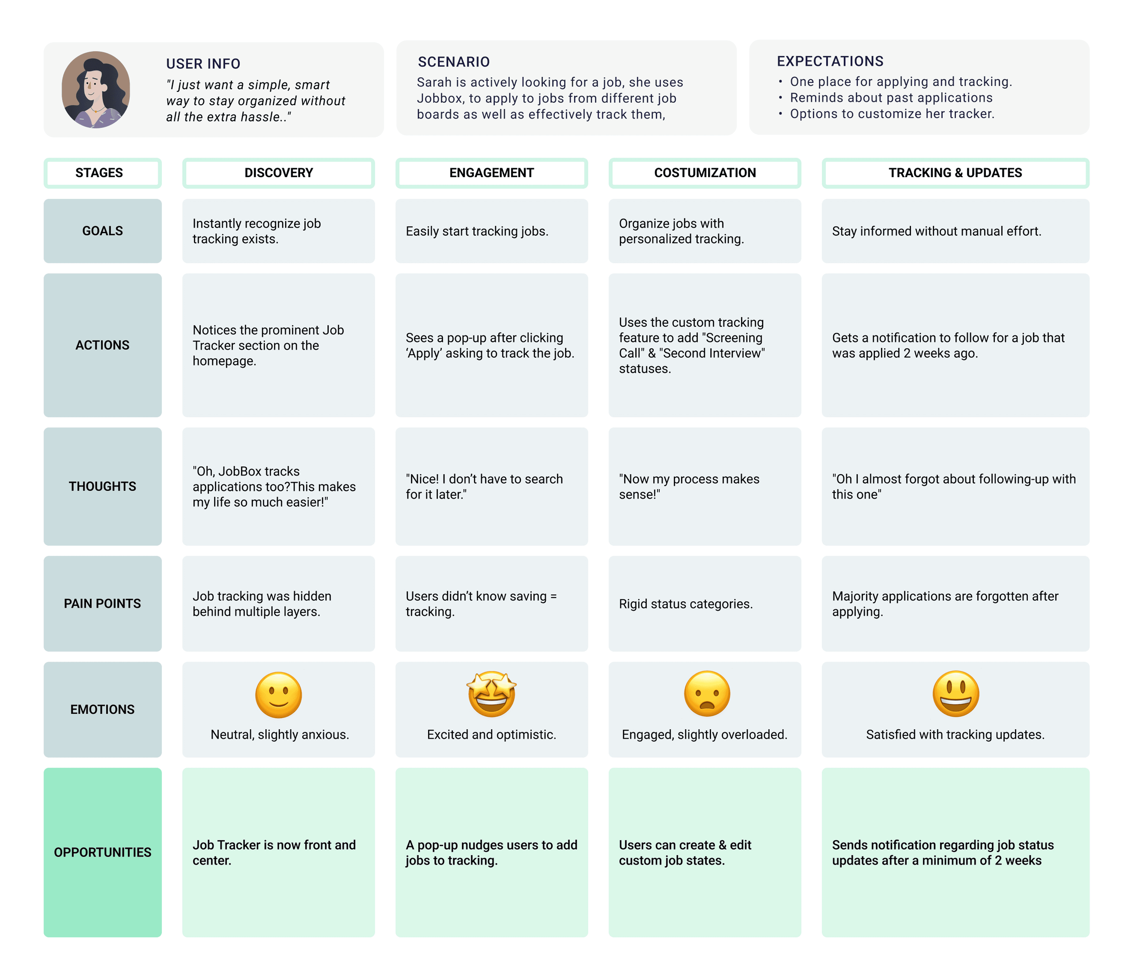
Journey Map
Mapping Sarah's Journey
After bringing Sarah to life through storyboarding, I mapped out her entire user journey to get a bird's-eye view of her experience. This wasn't just about her actions, but about understanding her feelings every step of the way.
Ideation
Sketching Key Elements
With a clearer idea of the problem, I quickly sketched some initial concepts. This process let me quickly explore and visualize how key features could be integrated into the user flow.
Key Features:
Making Job Tracker More Noticeable
Customizable Tracking
Clear Call-to-Action (CTA)
Nudging for Updates
Encouraging Job-Tracking
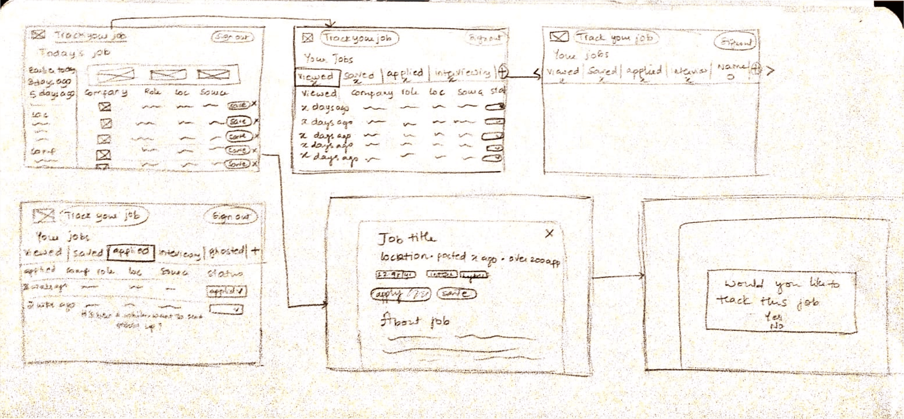
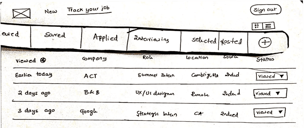
Paper Prototypes
Testing goals
Do users finally realize job tracking exists?
Is adding new job categories easy?
Understanding how users feel about “Save” CTA.
What the users said
Job Tracking was clear and liked the flexibility.
One user wanted to see all her job updates at one place.
Preferred the “Save” icon over CTA, as it was easy to distinguish.
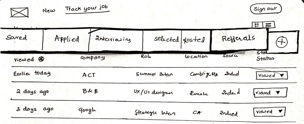
Iteration
Mid-Fidelity Designs
What I changed
Added an activity page, where users can see updates on jobs they applied to, a while back.
Experimented with a drag-drop feature, inspired from most of the competitors.
What the users said
The activity page was confusing as it didn’t really suggest them about what to do.
Users found the drag-drop feature to be very satisfying, while majority of them liked both the views.
“How do I delete a job in the tracker?”
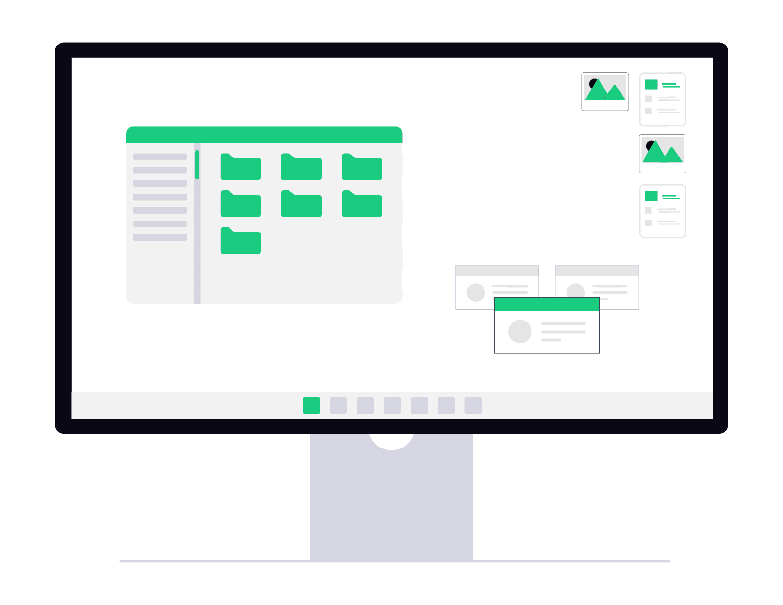
Hi-Fi Designs
The Final Screens
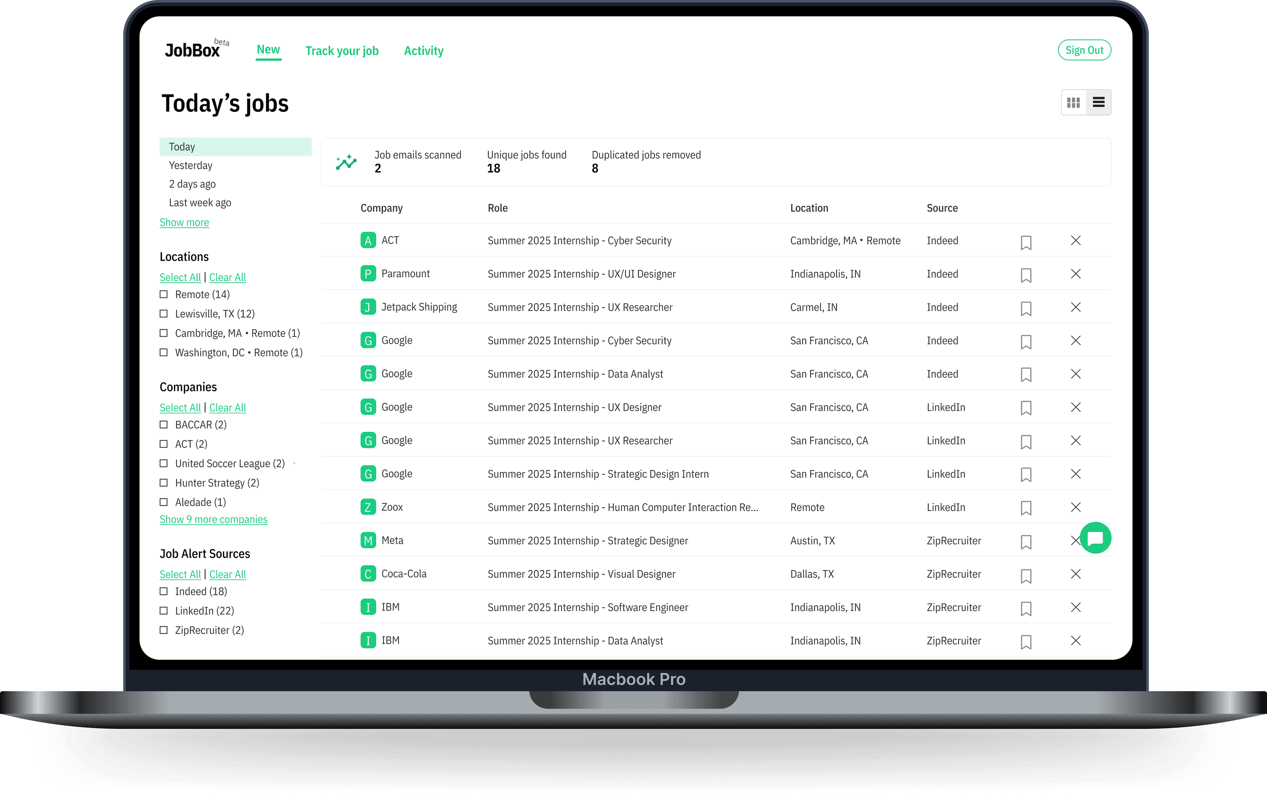
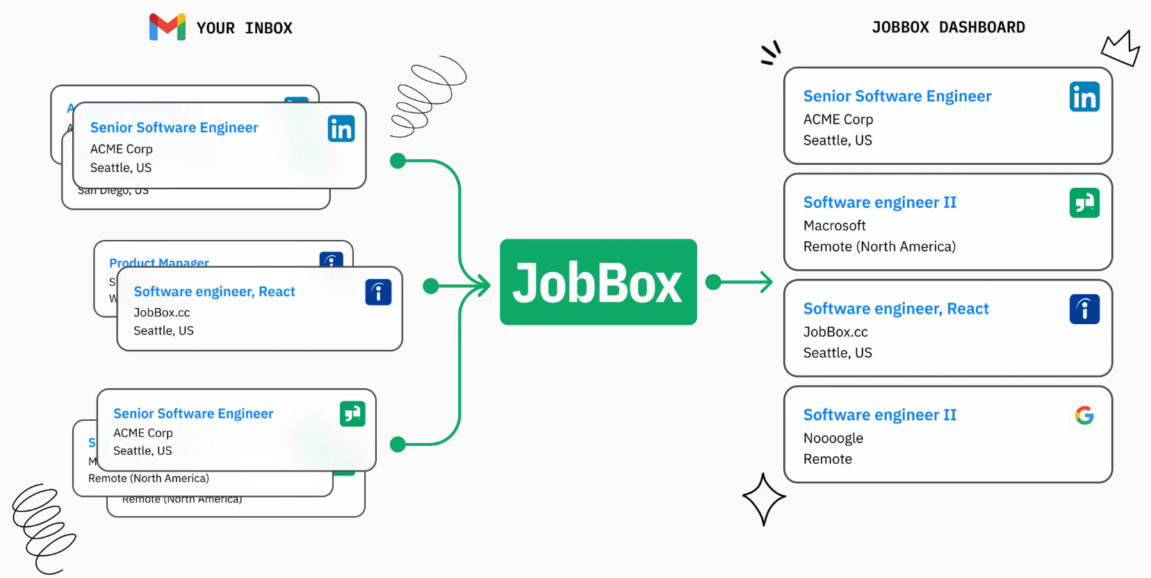
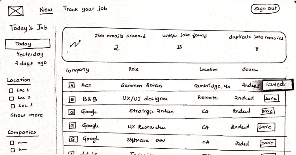
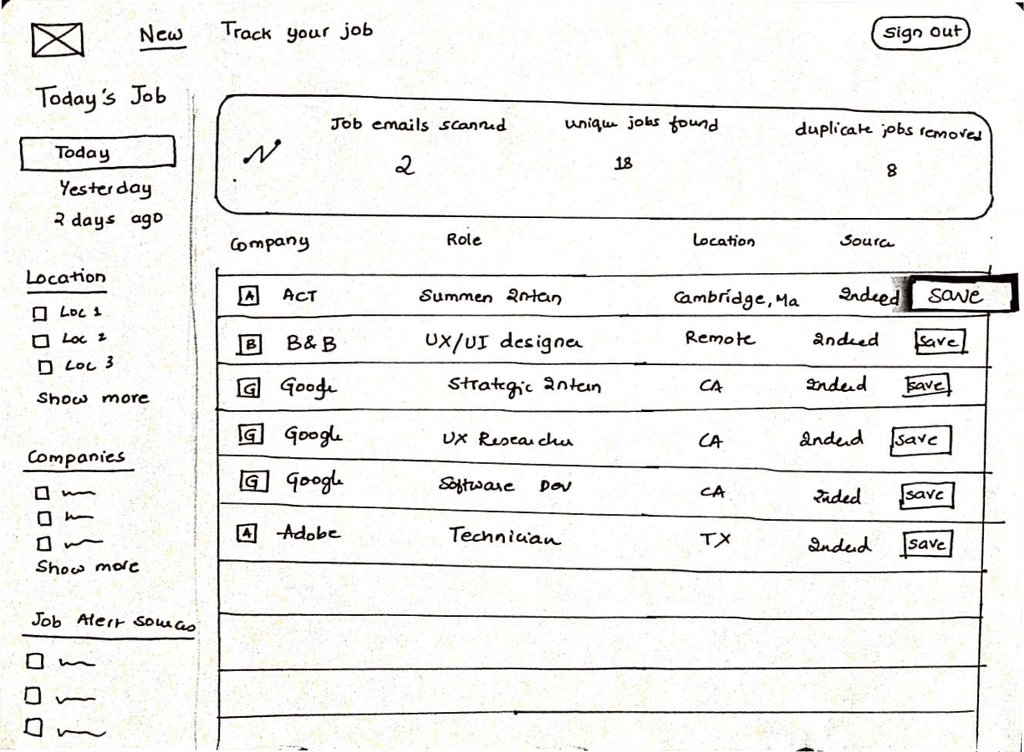
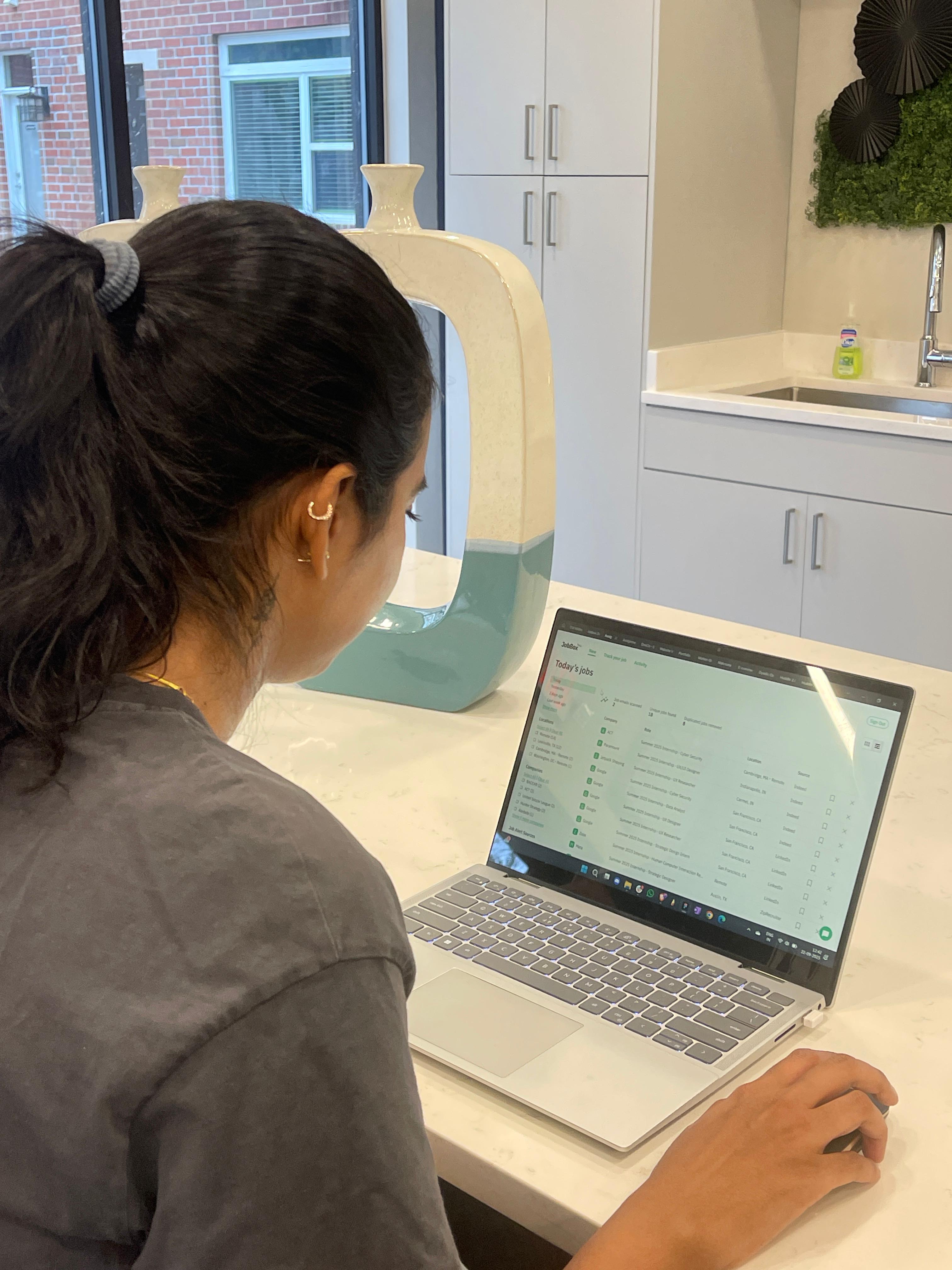
The Centralized Dashboard
This screen immediately solves the problem of application overwhelm by consolidating job listings from a user's favorite sites (like Indeed and LinkedIn) into a single, clean feed. Users can quickly filter the list and see a count of unique jobs discovered, reducing the noise of duplicate posts and letting them feel more in control of the market.
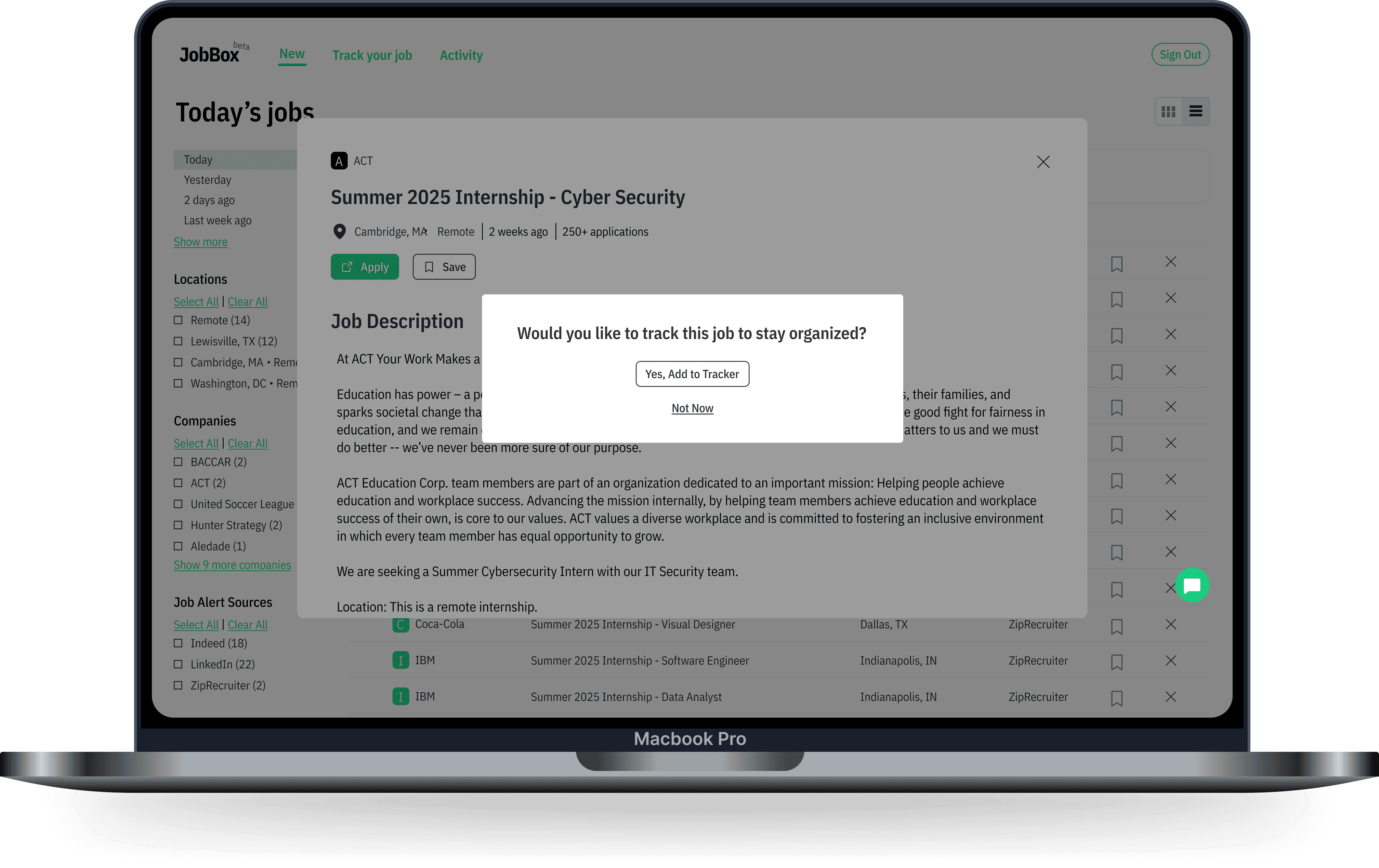
Job Description & Proactive Nudge
When a user clicks a job, they see the full description. Crucially, a proactive pop-up appears asking, "Would you like to track this job to stay organized?" This solves the problem of manual tracking by creating an immediate and simple call-to-action (CTA), making it impossible to forget to add the job later.
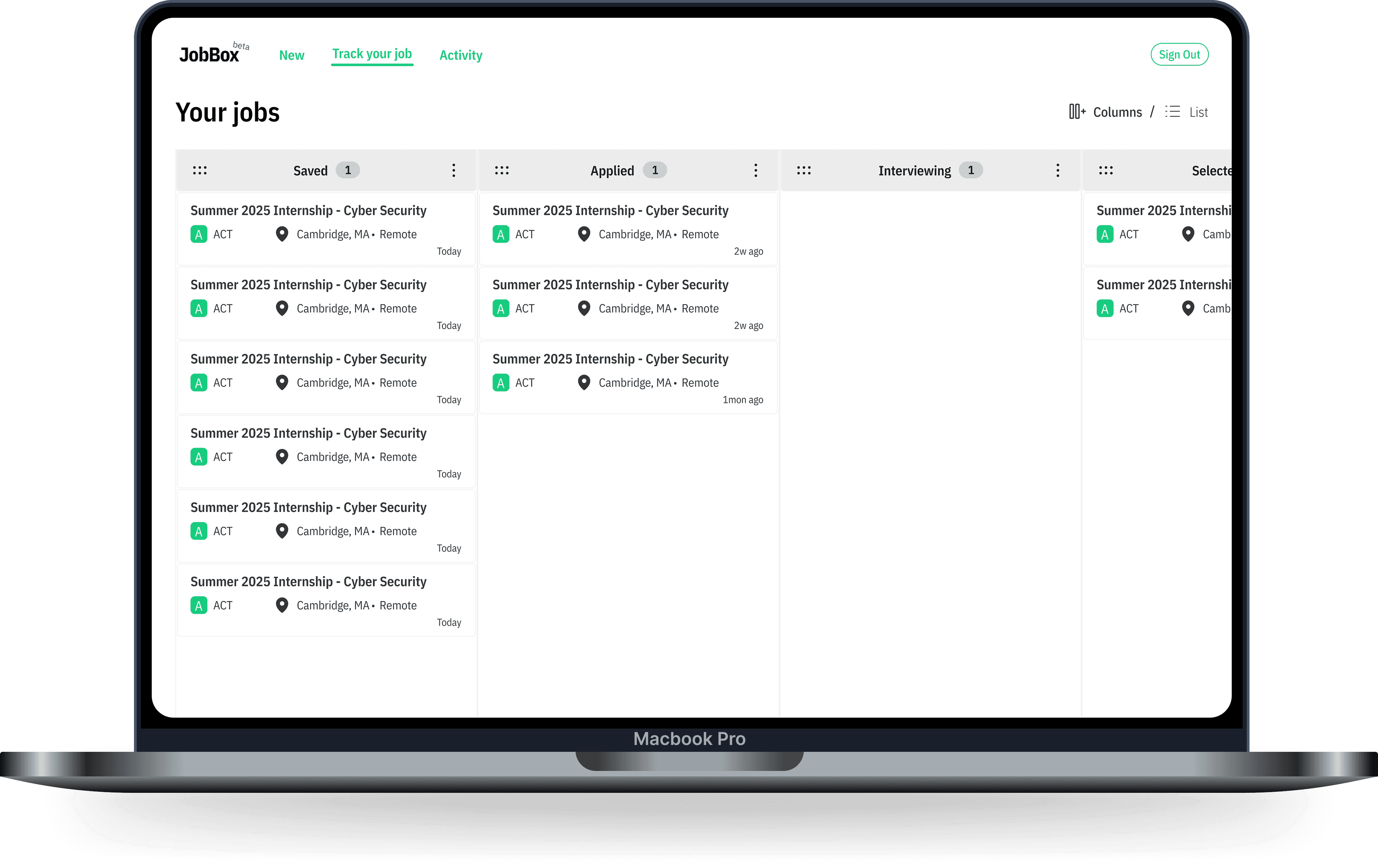
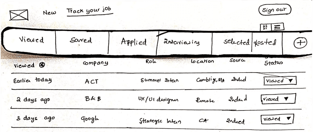
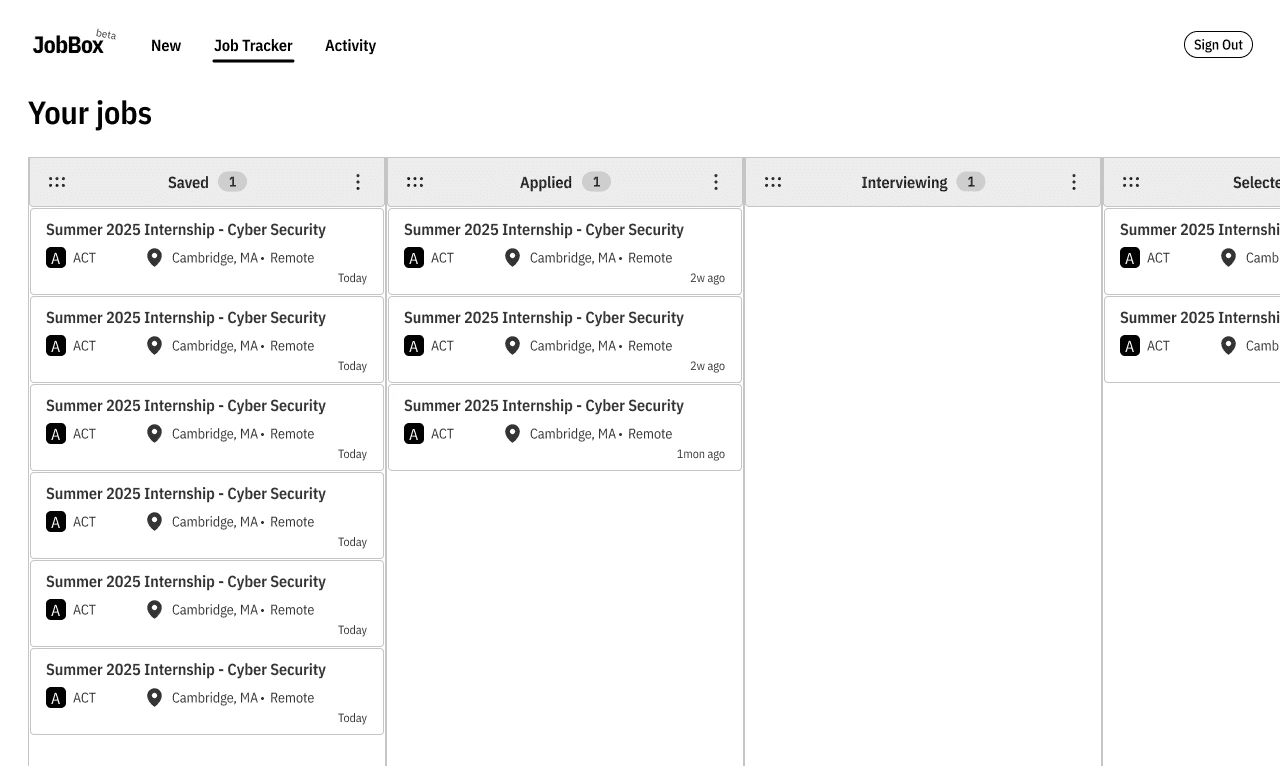
Flexible Job Tracker
This is the main solution screen, transforming the messy spreadsheet into a visual pipeline. Key features include:
Customizable Stages: Users can easily rename or add new columns to fit unique stages like "Portfolio Review" or "Design Challenge."
Drag & Drop: Moving applications between stages is simple and visual.
Intelligent Tracking: The system monitors the user's email for keyword-based replies (like "interview confirmed") to automatically suggest a status change, keeping the tracker accurate with minimal effort.
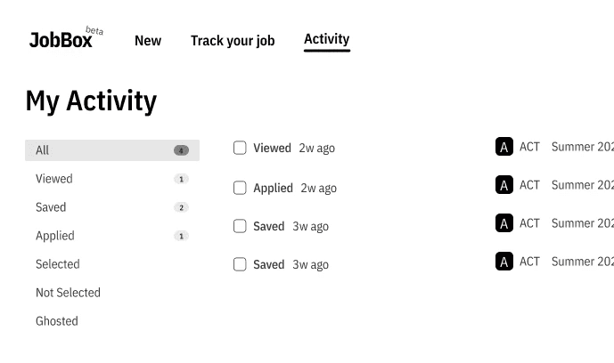
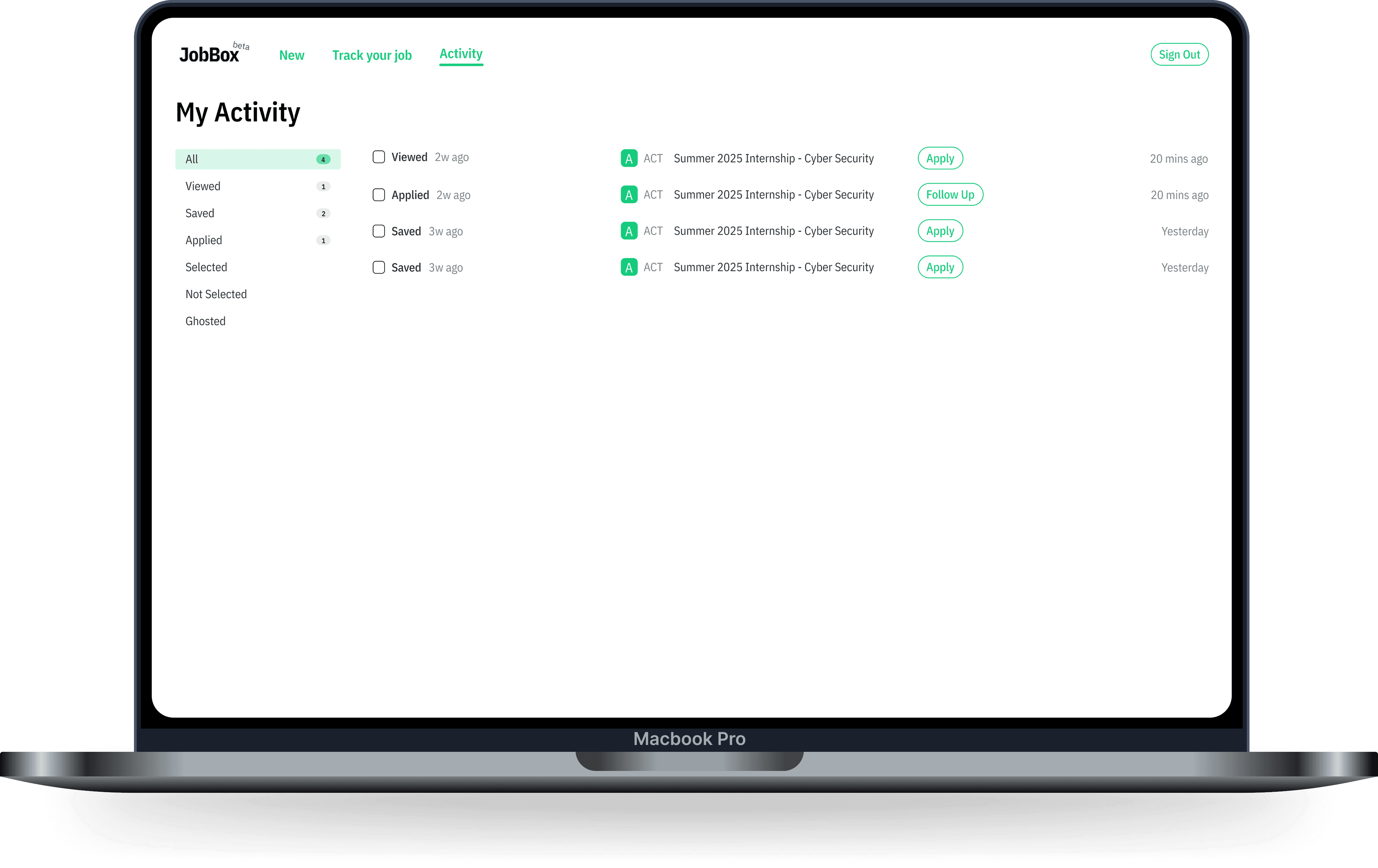
Activity Page
This screen provides a chronological breakdown of recent application activity, focusing on what needs attention. Users can see every status change, saved job, or application sent. By showing "Apply" or "Follow Up" CTAs next to recent entries, the system guides the user's next step, replacing mental effort with clear, actionable guidance.
Results
What My Design Achieved
Increase in feature usage.
Users actively embraced the customizable tracker and smart nudges.
10
User satisfaction.
Job seekers felt significantly more organized and less stressed with JobBox.
Ease of use.
The interface feels intuitive & straightforward, simplifying job tracking.
Reflection
Further Steps
3
4
5
6
7
8
2
3
4
5
6
7
%
%
Sharing...
Your file is almost finished
Collaboration features
Allow users to share job trackers with mentors for feedback.
Today's jobs
Viewed
Saved
Applied
Selected
Rejected
Ghosted
Mobile app development
Develop a mobile app for job tracking on the go.
Predictions
Google - Software…
64%
07
Salesforce - Analy…
21%
14
OneCo - UX Desig…
41%
21
Enhanced AI integration
Use machine learning to predict job success and suggest follow-ups.
What I Learnt
People need flexibility
Everyone tracks their job search differently, so giving users control over their own process made a huge difference.
If they can’t see it, they won’t use it
Job tracking was hidden before, and simply making it more visible got more people to engage with it.
Feedback changes everything
What seemed like a great idea in theory didn’t always work in practice. Testing with real users led to way better decisions.
Small tweaks, big impact
Simple changes, like clearer buttons or fewer clicks, made tracking jobs way easier and less frustrating.
Job alerts from your favorite sites